Confident, exciting and innovative
We have created an energetic brand that signals to the outside world that we are a confident, exciting and innovative university.
The brand is a visual representation of what we stand for and should help inspire people to do their best.
The identity and its system have been carefully considered, researched and tested to make sure we have created the best image for Teesside University London.
How to use our logo
The logo is only used in two colours, black or white out depending on the background.


Sizing the logo
An exclusion zone is in place to make sure that other graphic material or type does not interfere with the logo. This zone equates to a space that uses the width or half the height of ‘T’. The only exceptions to this exclusion zone are where space does not permit, such as for merchandise.
![]()
The recommended minimum sizes for reproducing the logo are:
- A1 – logo size 263mm
- A2 – logo size 186mm
- A3 – logo size 130mm
- A4 – logo size 93mm
- A5 - logo size 66mm
- A6 and business card – logo size 48mm (minimum recommended size)
- Email header – 218 pixels x 58 pixels
Dos and Don'ts
![]()
DO NOT confine the logo within a box
![]()
DO NOT condense or stretch the logo in any way
![]()
DO NOT alter the logo in any way
Download our logo
- Black: RGB (screen) | CMYK (print)
- White: RGB (screen) | CMYK (print)
- Teesside University logos
Colours
Yellow
C: 15
M: 0
Y: 88
K: 00
Blue
C: 87
M: 67
Y: 38
K: 30
Light blue
C: 72
M: 3
Y: 12
K: 0
Black
C: 100
M: 100
Y: 100
K: 100
Online
These colours have been tested for accessibility and meet the WCAG colour contrast ratio.
Yellow
#eff51f
Use black text on top
Blue
#2F4460
Use white text on top
Light blue
#107293
Use white text on top
Light grey
#f8f8f8
Use black text on top
Using these colours in a template
Guidance on adding colours to word or excel
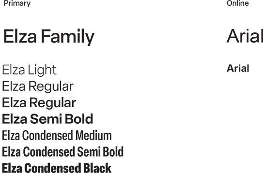
Fonts
Elza family is recommended for all Teesside University London printed marketing materials.
Arial is the default typeface used on online formats when the above aren’t available.